ShopDreamUp AI ArtDreamUp

Deviation Actions


Description


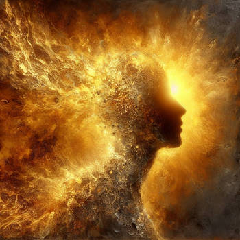
This is called "Opposites attract" and shows the attraction between men and women - who are as different as fire and water.
For a contest at [link] (theme: opposites attract)
Thanks to:
istockfoto: [link]
 [link]
  [link]
 [link]
 [link]
 [link] and [link]
 [link]
 [link] and [link]
 [link]
[link] aboutpixel.de © Astraios
[link] aboutpixel.de fresh himberries © Christoph Ruhland
sxc.hu: [link] and [link]
Ich gebe
 die Erlaubnis, mein Bild in ihrer Galerie zu veröffentlichen.
Image size
1000x750px 705.98 KB
© 2009 - 2024 stella-marina
Comments46
Join the community to add your comment. Already a deviant? Log In
Ok, i found some time off, so i apologize for the late response to your request, but i am here now <img src="e.deviantart.net/emoticons/s/s…" width="15" height="15" alt="
Just going off of first impressions, this art somewhat struck me, as a battle between two components which only ever has one outcome.
Moving on to my own personal take of this picture.
Your concept you tried to create, and did very well in doing so, is intriguing yet realistic. It sets two different elements, two elements that we as people use daily and take for granted also. The picture shows the battle for supremacy as such.
This picture i am finding hard to critique because there is 'bad' about it, its simple, original to a point, stands out, its meaning is there, whether it is the meaning/moral you wanted to get across or not is besides to point, the picture shows a moral for everyone or some story. The only flaw, which that's a heavy word to use here, so the only downfall would be the black open space. I just don't feel it, i feel something that not even i can think of should go behind them, they need something more to create a real impact of depth. The coloring is nice, it sticks to the two themes Blue for water, red for fire. You or whoever else might read that little note there and think "well obviously" but i do see and have made the mistake where i go way off the color scheme, and devalue the arts overall striking feature.
"Breaking It Down"
Pros:
+ Concept is great
+ Simple yet holds a lot of elegance, and a moral // story for each person to view this piece of work
Cons:
- Background could of done with something to create some depth to the image
- Don't make work which i find hard to critique because its really good with no flaws and then end up rambling on....wait what was i saying?